IOS APP
Proto
Cole 8
Design an anonymous communication experience
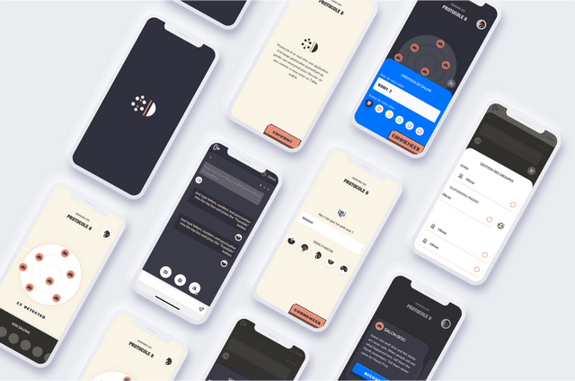
Protocol 8 is a chat application interposed by bluetooth technology. It allows us to exchange and to be able to create private circles while maintaining anonymity.
Client: Side Project
Project: IOS app
Profil: Product Designer
Team with: Nicolas Zinovieff
01
01 Introduction
Challenge
We have plenty of messaging apps. The gamification of this type of application had to make sense. Play on distance, discovery, radar research.
02
02 Problem Statement
Scope of Work
For a side project, the idea was to test this technology and the possibilities it could offer. Achieving an experience that respects everyone's freedom without frustrating the user.
UX Design
Research and problem established. Implementation of a low-fi proto and test.
UI Design
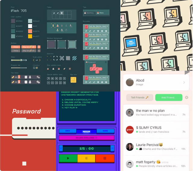
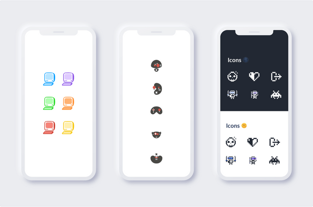
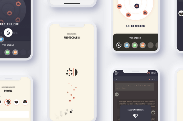
Looking for an artistic direction that I was not used to. With retro-gaming.
Développement
Making of a first MVP developed to test behaviours and technical feasibility.
02
02 Problem Statement
Preparation
Like any project, that requires an organization and validation points at each stage. It was important to validate step by step. To see if our principle was viable in concrete cases.
Concept
MVP
Product
Phase 01 - UX Research
Phase 02 - UX Conception
Phase 02' - Test
Phase 02'' - Test
Phase 03 - Branding
Phase 03' - UI & Animation
Phase 04 - Mobile app backend
Phase 04' - Mobile app frontend
02
02 Problem Statement
User Research
Customer Interview
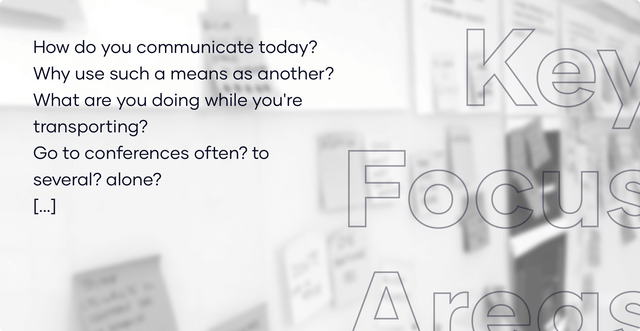
A brief interview of 30 to 45 minutes with target people to challenge different contexts.
Customer Journey
Retrace the current experience and have an accurate vision of friction points and opportunities.
Information Architecture
Prioritize the elements to be proposed and allow to have a dynamic interface.
Prototype testing
Quickly iterate through code-free prototype and challenge native features with the technology used.
02
02 Problem Statement
Goals
One more chat app? The idea is to offer a fast, simple way to communicate, while respecting user data. Beyond the simple encounter, this application can be interesting for conferences, places of culture and exchange, events ...
Intuitiveness
Explore how to communicate, quickly find interest and get users to find each other.
Fast
This application does not require a lot of resources and therefore allows a quick grip.
Data management
Data protection, security through user self-management of discussions.
03
03 Solutions
Outcome
Following the first making of a developed MVP, we carried out user tests. The parameters were the creation of a chatroom, the different interactions depending on the status of the chatroom, and affordance depending on the connection.
Of course in this project, the idea was to test several things in a short time. The native treatment of dark mode, challenging the UI with a retro-gaming artistic direction to bring a more graphic universe and get out of my comfort zone.
UI Improvement
Better affordance of buttons + improved “Empty states” screens
Simplified creation
Onboarding simplified to move on to the experience right away.
Validated MVP
Evaluation of the features put in place for a structure of a future roadmap.
Event Version
Scope of the application in different contexts with a dedicated interface.
04
04 Ideation
User Flow
Following the validated map experience, I materialized the entire MVP in the form of userflow, which allows to have an exhaustive vision and to highlight the different interactions.
05
05 Conception
Wireframes & low-fi prototype
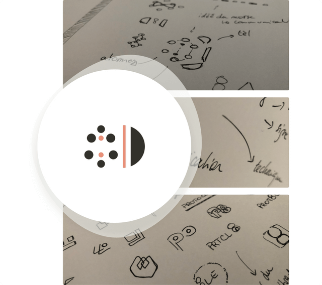
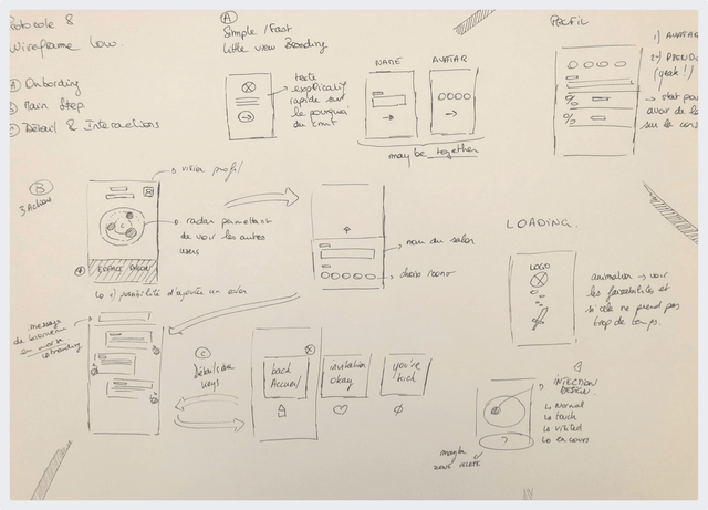
In this project, I used prototype papers allowing me to quickly prototype and validate the 3 key concepts of this step: the path, the functionality and the content.
07
07 Conclusion
Learnings
Exploring native development and the different possibilities was more than interesting. Make a dark mode and asset management on Xcode.
Soon on App Store 🤞🏼